
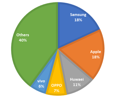
A pie chart (or pie graph) is a specialized that can be used in R programming graph used in statistics.
A variable which is independent in nature is plotted around a circle in either a counter clockwise direction or a clockwise direction.
The dependent variable which is usually a percentage is rendered as an arc whose measure is proportional to the magnitude of the quantity which needs to be displayed.
A wedge-shaped slice is created at the centre of the circle with each arc depicted by constructing radial lines from its ends.
An independent variable can attain a finite number of discrete values possibly five while dependent variable can attain any value from 0 to 100 percent.
R Programming language has a large number of libraries to create charts and graphs and display them in a new window.
The pie() function is used to create pie chart in R which takes positive numbers as a vector input.
Here we can create pie-chart in R using the following syntax:
pie(x, labels, radius, main, col, clockwise)
Where
- x: It is a vector containing the numeric values that are used in the pie chart.
- labels: It is used to give description to the slices in pie chart.
- radius: It indicates the radius of the circle of the pie chart i.e. value between −1 and +1.
- main: It represents the title of the chart.
- col: It is used to give colour palette.
- clockwise: It is a logical value indicating if the slices are drawn clockwise or anti clockwise.
To create and run our R program in Visual Studio we must first install some tools.
Now open Visual Studio on your pc and then click on Get Tools and features… inside Tools.
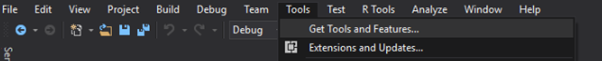
Now in the feature installation window check and install the following features
For Visual Studio 2017
Contains Tools for Data Science

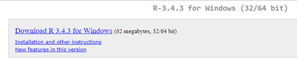
After this please install R tools from the following link if the above package is not installed properly from the following link.
But it is not necessary
https://docs.microsoft.com/en-us/visualstudio/rtvs/installing-r-tools-for-visual-studio
You can also install R programming tool go to the following link for better support and download the software and install it
For Windows Users:
And in either Visual Studio R Interactive or RGui type and install.
install.packages(“plotrix”)
For Linux Users:
If you are on Linux platform then you can use this fast and easy command used in Linux which can be used to install R. The yum command is used for installing like this:
$ yum install R
For Ubuntu Linux or other Debian-related OSs, a more direct method is:
$ apt-get install r-base
Now let us start creating our R application in visual studio
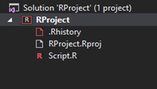
Go to Files ->Project and add a new R project
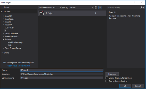
This is our project structure:
Now on the top left side is a new R file (script.R) where we can edit source code with all of Visual Studio Ide editing features.
Also on the bottom left of Visual Studio is where you can find an R Interactive window in which you can interactively develop and test code.
We can directly use R Interactive without the need of opening any new project.
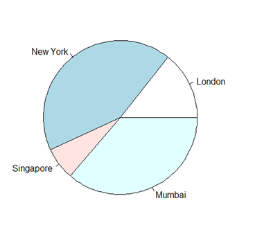
The following is a Simple example for Pie Diagram which either be performed in RGui or Visual Studio
# Create data for the graph.
x <- c(21, 62, 10, 53)
labels <- c("London", "New York", "Singapore", "Mumbai")
# Plot the chart.
pie(x,labels)
# Give the chart file a name.
png(file = “city.jpg”)
# Save the file.
dev.off()
Output:
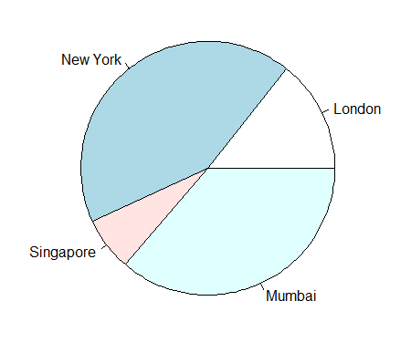
# Create data for the graph.
x <- c(21, 62, 10, 53)
labels <- c("London", "New York", "Singapore", "Mumbai")
# Give the chart file a name.
png(file = “city_title_colours.jpg”)
# Plot the chart with title and rainbow color pallet.
pie(x, labels, main = “City pie chart”, col = rainbow(length(x)))
# Save the file.
dev.off()
Output:
# Create data for the graph.
x <- c(21, 62, 10,53)
labels <- c("London","New York","Singapore","Mumbai")
piepercent<- round(100*x/sum(x), 1)
# Give the chart file a name.
png(file = “city_percentage_legends.jpg”)
# Plot the chart.
pie(x, labels = piepercent, main = “City pie chart”,col = rainbow(length(x)))
legend(“topright”, c(“London”,”New York”,”Singapore”,”Mumbai”), cex = 0.8,
fill = rainbow(length(x)))
# Save the file.
dev.off()
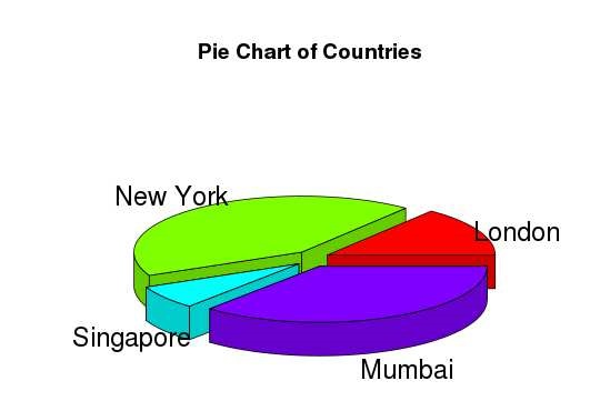
# Get the library.
library(plotrix)
# Create data for the graph.
x <- c(21, 62, 10,53)
lbl <- c("London","New York","Singapore","Mumbai")
# Give the chart file a name.
png(file = “3d_pie_chart.jpg”)
# Plot the chart.
pie3D(x,labels = lbl,explode = 0.1, main = “Pie Chart of Countries “)
# Save the file.
dev.off()
The above code Outputs a 3D map:
Syllabus of Data Science training in Mumbai