
A bar chart is a visual representation data in a form resembling rectangular bars with length of the bars being proportional to the value of the variable.
The function barplot() to create bar charts in R.
Both vertical and horizontal bars can be drawn in the bar chart using R and in bar chart each of the bars can be given different colours.
The common bar graph shows comparisons among discrete categories of values.
In Bar Charts One axis of the chart shows the specific categories being compared while on the other hand the other axis represents a measured value.
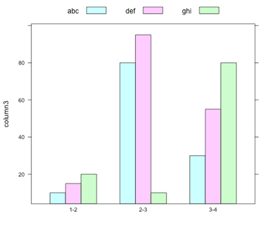
An amount portion of general bar graphs which are present bars clustered in groups of more than one hence it shows the values of more than one measured variable.
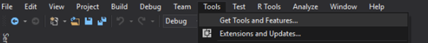
To create and run our R program in Visual Studio we must first install some tools.
Now open Visual Studio on your pc and then click on Get Tools and features… inside Tools.
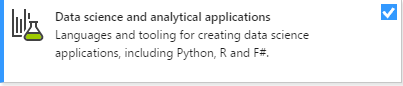
Now in the feature installation window check and install the following features
For Visual Studio 2017
Contains Tools for Data Science
After this please install R tools from the following link if the above package is not installed properly from the following link
But it is not necessary
https://docs.microsoft.com/en-us/visualstudio/rtvs/installing-r-tools-for-visual-studio
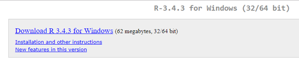
You can also install R programming tool go to the following link for better support and download the software and install it
For Windows Users:
For Linux Users:
If you are on Linux platform then you can use this fast and easy command used in Linux which can be used to install R. The yum command is used for installing like this:
$ yum install R
For Ubuntu Linux or other Debian-related OSs, a more direct method is:
$ apt-get install r-base
Now let us start creating our R application in visual studio
Go to Files ->Project and add a new R project
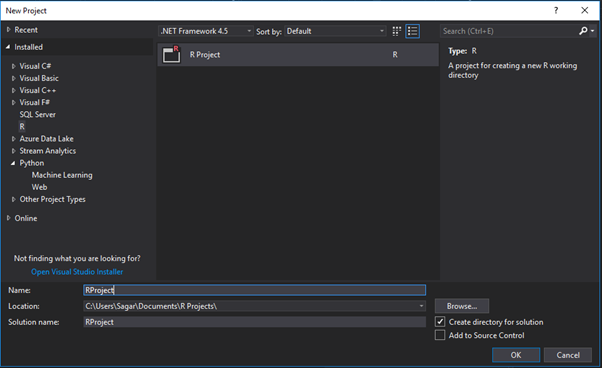
This is our project structure:

Now on the top left side is a new R file (script.R) where we can edit source code with all of Visual Studio Ide editing features.
Also on the bottom left of Visual Studio is where you can find an R Interactive window in which you can interactively develop and test code.
We can directly use R Interactive without the need of opening any new project.
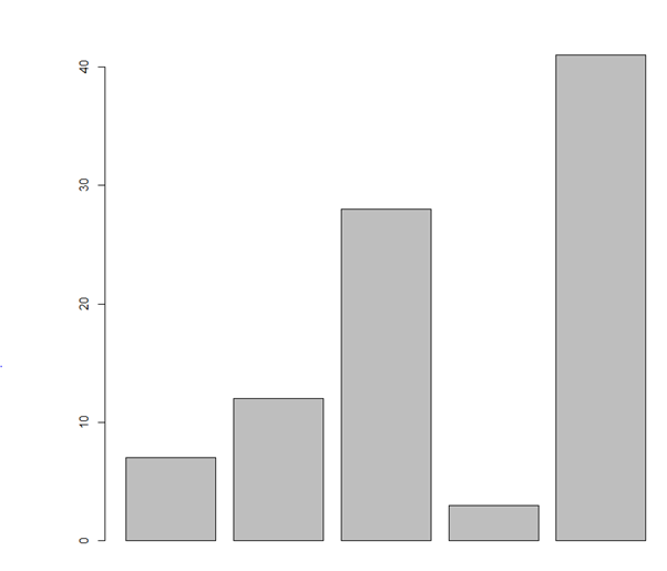
Let us now see a simple demonstration
# Create the data for the chart.
H <- c(7,12,28,3,41)
# Plot the bar chart.
barplot(H)
# Give the chart file a name.
png(file = “barchart.png”)
# Save the file.
dev.off()
Output:
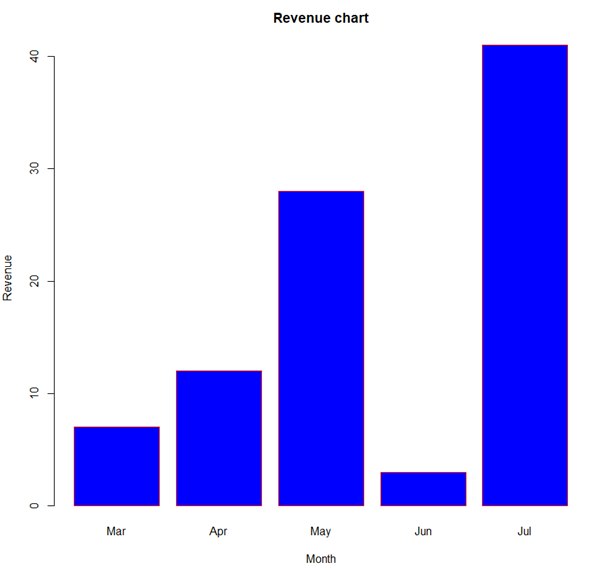
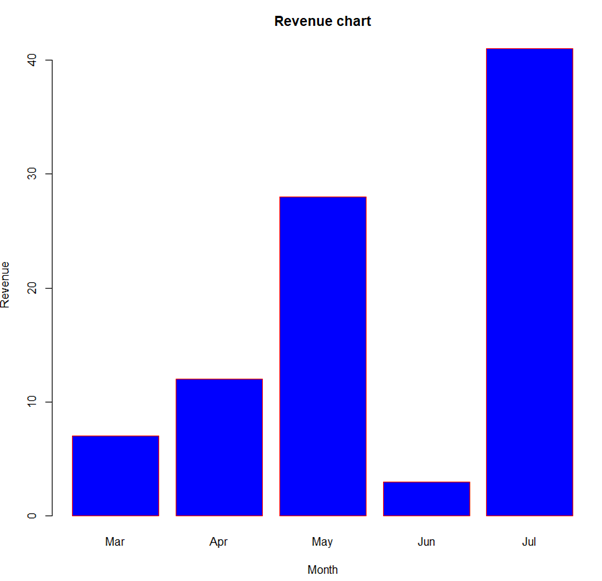
# Create the data for the chart.
H <- c(7,12,28,3,41)
M <- c("Mar","Apr","May","Jun","Jul")
# Plot the bar chart.
barplot(H,names.arg = M,xlab = “Month”,ylab = “Revenue”,col = “blue”,
main = “Revenue chart”,border = “red”)
# Give the chart file a name.
png(file = "barchart_months_revenue.png")
# Save the file.
dev.off()
Output:
# Create the input vectors.
colors <- c("green","orange","brown")
months <- c("Mar","Apr","May","Jun","Jul")
regions <- c("East","West","North")
# Create the matrix of the values.
Values <- matrix(c(2,9,3,11,9,4,8,7,3,12,5,2,8,10,11),nrow = 3,ncol = 5,byrow = TRUE)
# Give the chart file a name.
png(file = “barchart_stacked.png”)
# Create the bar chart.
barplot(Values,main = “total revenue”,names.arg = months,xlab = “month”,ylab = “revenue”,
col = colors)
# Add the legend to the chart.
legend(“topleft”, regions, cex = 1.3, fill = colors)
# Save the file.
dev.off()
Output:
Syllabus of Data Science training in Mumbai